This article shows you how to create a Chatbot user response by adding cards. A card is a visible display device that contains an image, a link, and a small amount of text. The purpose of a card is to present visual options to potential customers. If website visitors click an image, they move further down the sales funnel.
- A user response takes place when the Chatbot asks a website visitor for information. That request could be text input, selecting a menu item, or choosing a day on a date picker. Clicking a card is just one kind of user response.
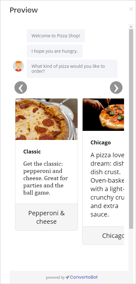
End result
A Chatbot with cards might look like the image below. Typically, the Chatbot contains a bundle of 2-4 cards that display like a slider.
1 Opening the Message block
You place a user response inside a Message block.
- Go to the Builder page.
- Locate the Bot you want to edit and then click Edit on the toolbar. The Builder page displays.
- Locate the Message block that will contain the user response.
- Click the Message block. The Message panel displays.
- Click Add to insert a new message line.
- Type a sentence that asks visitors to respond to a prompt.
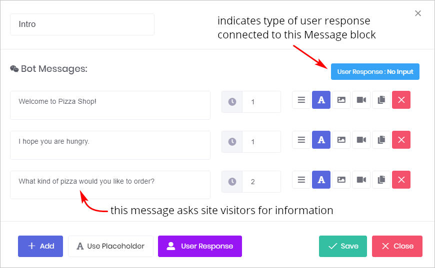
The image below shows a Message panel with 3 message lines. The blue box in the top right corner tells us that no user response has been set up for this Message block.
2 Opening the card template
You create and place cards inside a Chatbot by using a card template.
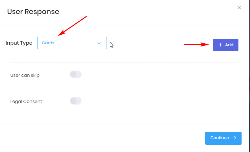
- Click User Response at the bottom of the Message panel. The User Response panel displays.
- Click the box beside Input Type. A drop-down menu displays.
- Select Cards.
- Click the + Add button. A Card template displays on the screen.
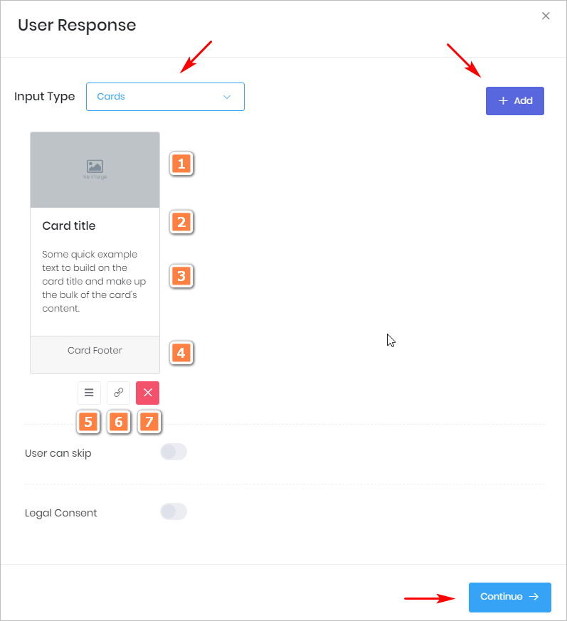
3 Creating a card template
You can create a card with the tools on the card template.
- Click the grey box to insert an image. For more information, see Adding an Image.
- Click Card title and then enter a unique name that describes the card’s content.
- Click the Body and then add descriptive text.
- Click the Footer and add a small amount of text, like a call to action (e.g. Order Now).
- Click and drag the Move button (3-bar icon) to change its display order when you have more than one card.
- Click the link button and then paste in a URL to add a link to the card. A new page opens when a site visitor clicks any part of the card.
- To remove a card from the display, click. Delete (red X).
- When finished, click Continue.
- Click Save on the User Response panel.
4 Previewing the cards
After creating a card inside one Message block, preview the results.
- Got to the Builder page and open the Bot.
- Click Preview in the menu.
- The Bot displays in the right side of the screen.

5 Customizing cards
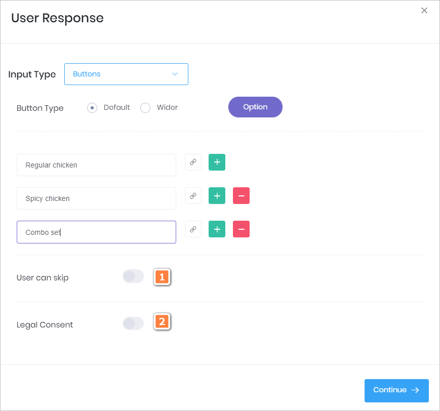
The User Response panel has 2 customisation features.
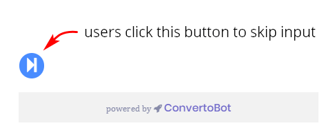
1 User can skip
- Click this toggle if you want to make button selection optional rather than required. In most cases, this option won’t be used because you want users to make a choice.
- The toggle places a blue button near the bottom of the Chatbot (see image below).
2 Legal Consent
- Click this toggle if you want to add a statement to the Chatbot that verifies a website visitor agrees to your privacy policy.
- For more information see: Adding Legal Consent.